Sometimes in the exam you are given data that concerns a future time period. In this case, the future data is a prediction or forecast, and you must make this clear when writing your report. You cannot state it in the present tense as a fact. You must make it clear to the examiner that this information is only a forecast. If you fail to do this you are making a factual error and your score for task achievement will be lowered.
Language for expressing a prediction
Words to express a prediction: predicted, expected, forecasted, anticipated
Future tense: will, is going to
It is predicted that the use of solar energy will rise.
It is anticipated that the use of solar energy is going to rise.
Note about the following task
The report is produced in 2010 so we can establish that all data before this point has actually occurred and everything after this date is a projection.
|
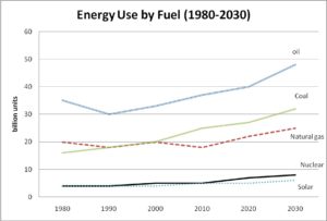
You should spend about 20 minutes on this task The graph below gives information from a report in 2010 about the use of energy in Australia since 1980 with projections until 2030. Summarize the information by selecting and reporting the main features, and make comparisons where relevant. Write at least 150 words |

Model answer
Given is a line graph, which displays energy consumption in Australia from 1980 to 2030; the energy is divided into different categories according to fuel sources. Overall, it can be seen that there is an upward trend for all types of energy except during the period from 1980 to 2010, and this trend is predicted to continue up to and including 2030.
In 1980, 35 billion units of oil were used to generate energy. Fluctuations in the first 15 years notwithstanding, the units of consumption experienced a steady growth from 1995 onwards, and projections show the usage will hit about 48 billion by 2030. Even though coal starts the graph much lower at 16 billion units and natural gas at 20 billion units, they are both expected to climb to end at 32 billion and 25 billion units, respectively, with the usage of coal now ahead by approximately 7 billion units.
Standing at 4 billion units in 1980, nuclear and solar energy underwent a marginal increase in their consumption units, and are expected to reach 8 billion and 6 billion units, respectively, in 2030, according to estimates.
[189 words]


Hi MikeAdmin,
Paragraphs 2 and 3 are without a topic sentence/phrase. I struggle with topic signalling myself. If I skip topic signalling altogether, what kind of a mark down am i looking at?
Thank you.
Possibly -1 off cohesion and coherence if the examiner was going to give you a & or higher,
zero off if the examiner was only going to give you a 6 anyway
Hi MikeAdmin,
I noticed that paragraph 2 and 3 don’t have topic sentences/phrases. Is it not an essential thing for an IELTS paragraph structure? If you could shed some light on the marks scored for topic signalling, that’ll be awesome.
Thanks.
It influences the score for cohesion and coherence. NOTHING is directly mentioned about this in the grading crietria. It is helpful for a 7 and almost essential for 8 for cohesion and coherence.
Hi MikeAdmin,
It is my understanding that the second and third paragraphs are lacking a topic sentence or at least a part a sentence signalling the grouping of the fuel sources. Is this ok? Is it better to have topic signalling? Can you score higher if you do?
Yes, this is an excellent observation.
Paragraph 2 “ The top sources of energy are Oil, coal , and natural gas”
Paragraph 3: “nuclear and solar energy produced the lowest amounts of fuel”
Hi Sir, I just have a query about “Even though coal starts the graph much lower at 16 billion units and natural gas at 20 billion units, they are both expected to consistently climb to end at 32 billion and 25 billion units, respectively,”.
How justifiable is it to say that they are “BOTH expected to CONSISTENTLY CLIMB” when it is clear in the graph that there are two declines to the energy consumption in case of natural gas usage? I mean, is it ok to ignore the drops along the way, and just summarize to make it easier to write the report?
You raise a good point. I have taken away the word “consistently” as this should not be used for natural gas.
Hello Sir, is there a need of specific compare and contrast sentences in such line graphs? Can you help me in locating it in the above report so that I get an idea how to write them in my exams?? Please.
The specific task that you referring to has a lot of data to get through and most of the comparisons are for how categories have changed over time….so this task is a better illustration of how to describe changes over time rather than to make comparisons and contrasts between categories [this is because there are five categories and just covering the change over time for this task is quite challenging…let alone having time to cover comparisons and contrasts between categories].
For this task, there is one comparison between categories here “Even though coal starts the graph much lower at 16 billion units and natural gas at 20 billion units”
If you want to see some comparisons and contrasts between categories I suggest you look at this task below:
https://www.ieltsanswers.com/model-answers-past-questions-reports/change-time.html