IELTS Task 1 Reports recent past test papers. Use these IELTS writing questions from recent tests to prepare for your test. You may like to see questions with model answers.
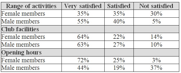
The table below shows the results of a survey to find out what members of a city’s sports club think about the club’s activities, facilities and opening hours.
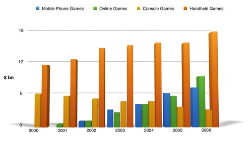
The bar graph shows the global sales (in billions of dollars) of different types of digital games between 2000 and 2006.
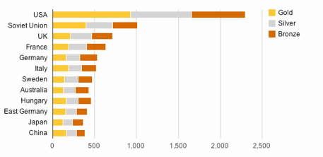
The chart below shows the total number of Olympic medals won by twelve different countries.
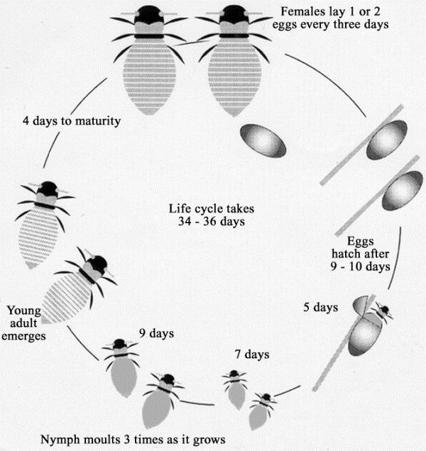
The diagram below shows the life cycle of the honey bee.
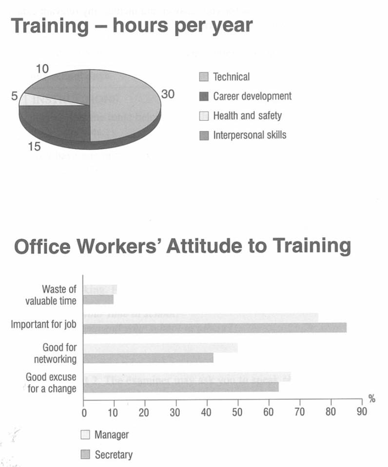
The graph and pie chart below give information on in-house training courses in a large financial company.
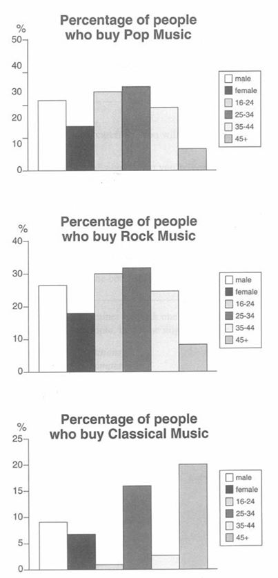
The graphs below show the types of music albums purchased by people in Britain according to sex and age.
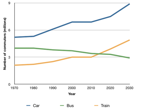
The graph below shows the average number of UK commuters travelling each day by car, bus or train between 1970 and 2030.
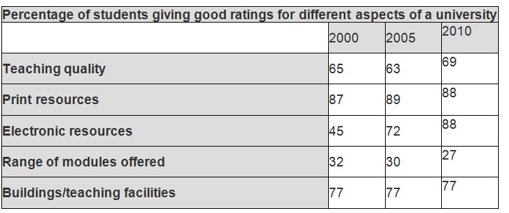
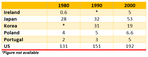
The table below shows the results of surveys in 2000, 2005 and 2010 about one university.
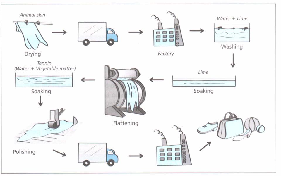
The diagram below shows how leather goods are produced.
The graph and bar chart below show the average monthly rainfall and temperature for one region of East Africa.

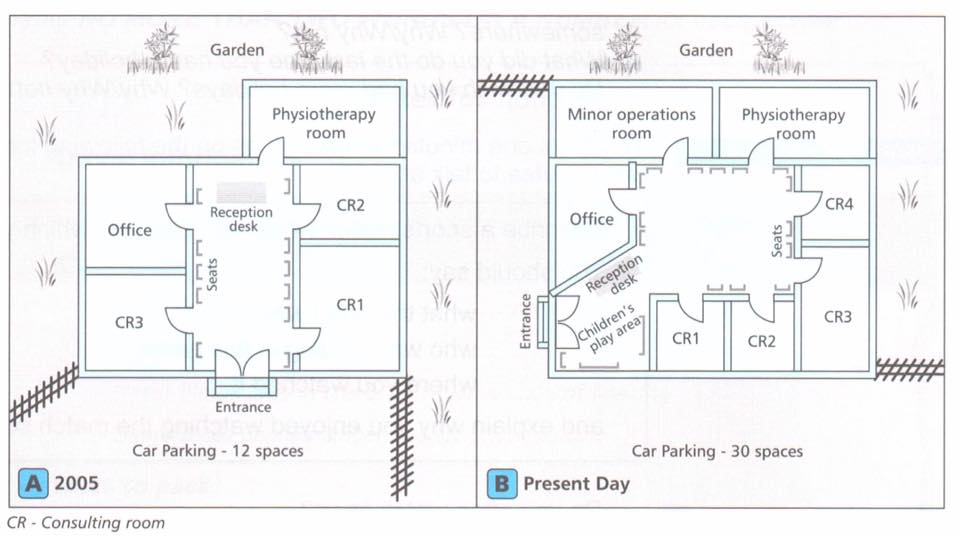
Plan A below shows a health centre in 2005. Plan B shows the same place in the present day.
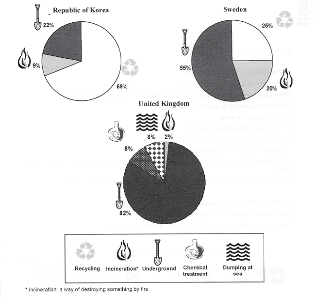
The pie charts below show how dangerous waste products are dealt with in three countries.
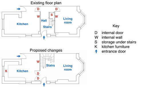
The diagrams below show the existing ground floor plan of a house and a proposed plan for some building work.
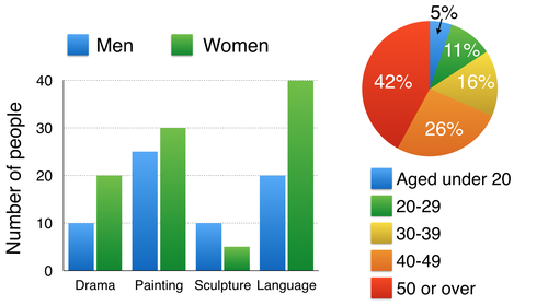
The bar chart below shows the numbers of men and women attending various evening courses at an adult education centre in the year 2009. The pie chart gives information about the ages of these course participants.
The table below shows the amount of waste production (in millions of tonnes) in six different countries over a twenty-year period.
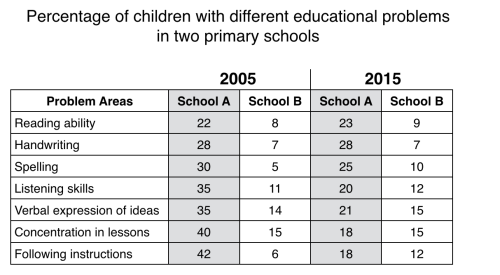
The table below gives information about the problems faced by children in two primary schools in 2005 and 2015.
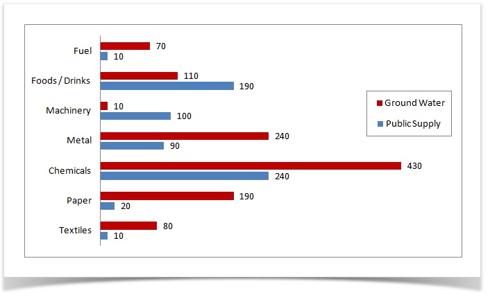
The graph below shows annual water usage (in millions of cubic meters) by industries in Australia.
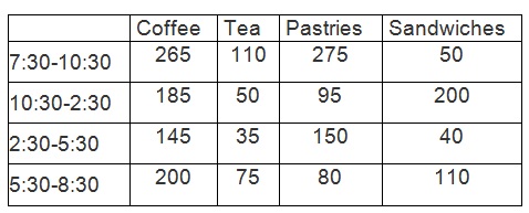
The table below shows sales, in US dollars, made by a coffee shop in an office building on a typical weekday.
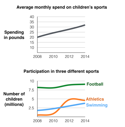
The first chart below gives information about the money spent by British parents on their children’s sports between 2008 and 2014. The second chart shows the number of children who participated in three sports in Britain during the same time period.
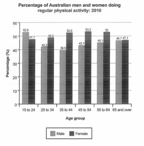
The bar chart below shows the percentage of Australian men and women in different age groups who did regular physical activity in 2010.
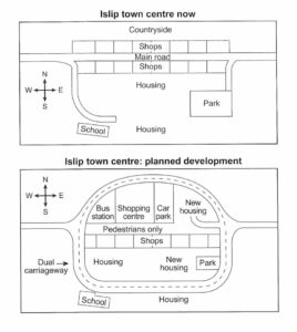
The maps below show the centre of a small town called Islip as it is now, and plans for its development.
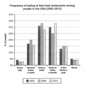
The chart below shows how frequently people in the USA ate in fast food restaurants between 2003 and 2013.
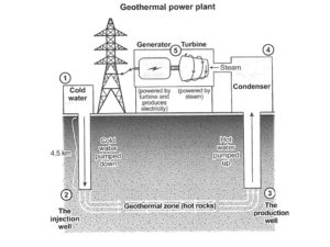
The diagram below shows how geothermal energy is used to produce electricity.
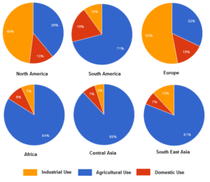
The charts below show the percentage of water used for different purposes in six areas of the world.
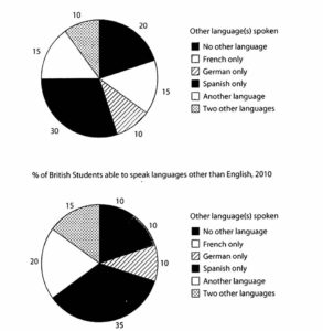
The charts below show the proportions of British students at one university in England who were able to speak other languages in addition to in 2000 and 2010.
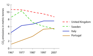
The graph below shows average carbon dioxide (CO2) emissions per person in the UnitedKingdom, Sweden, Italy and Portugal between 1967 and 2007.
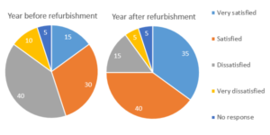
The table below shows the numbers of visitors to Ashdown Museum during the year before and the year after it was refurbished. The charts show the result of surveys asking visitors how satisfied they were with their visit, during the same two periods.
Total number of visitors to Ashdown Museum
During the year before refurbishment: 74,000
During the year after refurbishment: 92,000
Results of surveys of visitor satisfaction
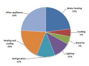
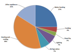
The first chart below shows how energy is used in an average Australian household. The second chart shows the greenhouse gas emissions which result from this energy use.
The percentage of household energy use in Australia:
The percentage of greenhouse gas produced in Australia:
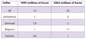
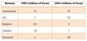
The tables below give information about sales of Fairtrade*-labelled coffee and bananas in 1999 and 2004 in five European countries.
Sales of Fairtrade-labelled coffee and bananas (1999 & 2004)
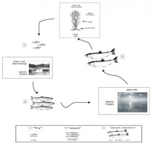
The diagrams below show the life cycle of a species of large fish called the salmon.
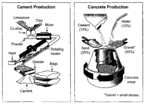
The diagrams below show the stages and equipment used in the cement-making process, and how cement is used to produce concrete for building purposes.
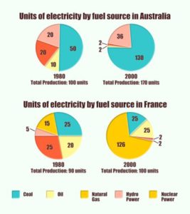
The pie charts below show units of electricity production by fuel source in Australia and France 1980 and 2000.
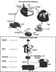
The diagrams below show the life cycle of the silkworm and the stages in the production of silk cloth.
Useful Links
Join my website to receive updates
